Easy Quilts Using Color Theory by Moda
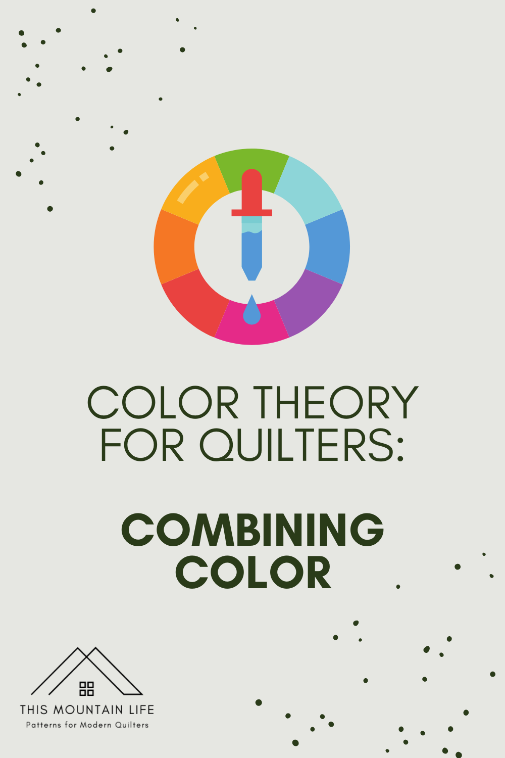
Color Theory for Quilters: Part 1 - Combining Colors

I hear from quilters all the time that putting together fabric pulls is one of their favorite parts but also one of the most difficult parts.
Maybe you put your favorite colors together but they just don't seem to work.
Maybe your combinations looked great as a nice, tidy stack but after they're sewn up it just looks wrong.
Shopping online is even more challenging!
In this series, we will explore color theory together and look at a few ways to make every one of your fabric pulls fantastic.
In today's lesson, we'll focus on the basic premise of color theory and common issues with fabric color combinations: tone and temperature.
First, tone: this one is pretty obvious. Colors vary from very light to very dark and every single shade in between.
Here's a sample color strip showing a range of pinks from light to dark:

Kona Cotton in Primrose, Melon, Pomegranate, Sangria
So what color tones should you use in your quilt? Any that you want! Just be intentional about how you combine them.
You can use a range of tones in the same color, just like these pinks. The technical term for this is "monochomatic" - which means one color.
If you take this approach (one of my favorites!), remember contrast!
You need variety between the shades. Rather than choosing two medium shades and two dark shades..try choosing a light, a light to medium, a medium to dark and a dark shade. The variation gives visual interest and keeps the eyes moving over your finished quilt.
Here's my monochromatic Thrive Quilt (pattern by Suzy Quilts).

Depending on the pattern that you are using, you might play up this color choice by arranging them in order. This is often called a gradient or more recently, ombre.
Here's an ombre Kensington quilt!

How about mixing colors?
You can use different colors of all the same tone. Think Pastels! Or Jewel Tones! Or Neons!
Here's a Portugal Quilt in all medium tones.

Can you mix light and darker tones in the same fabric pull? You absolutely can! Just remember balance.
Example If you choose several medium tone fabrics and one dark fabric - the dark fabric is going to stand out and draw the eye. That can be okay if you want to draw attention to a certain element.
Here's a Seeing Double quilt (pattern by Then Came June) that relies on the contrast between darker and lighter colors to create the diamond design.

A safe route is to chose a mix of tones in different colors.
Here's the cover quilt for the Harriet Pattern. I used four colors - two are light and two are a medium dark. They balance each other out!

Now that we have a good grapes of tone….let's look at the second basic element of color.
Temperature.
Colors have a temperature - you probably know a color's temperature instinctively without even realizing that you're seeing it.
In color theory, we describe colors as "warm" or "cool" - think a warm blue vs a cool blue.
Let's do a quick temperature check:
Are the warmer colors on the right or the left?

Kona Cotton in Medium Pink and Primrose

Kona Cotton in Coral and Flame

Kona Cotton in Blueprint and Pacific

Kona Cotton in Sprout and Green Tea
The warmer color is on the right side. In each pairing, the colors are the same tone, they are incredibly similar - so similar that from a distance they might look alike.
But when combined together, the temperature makes a significant difference.
Here's all the warm colors together:


They both really shine, don't they?
How about these?

I've combined two warm and two colors here. You probably notice that they aren't as cohesive and clear.
So how do we choose fabrics of the right temperature?
If you're starting a fabric pull from scratch and you're not sure which temperature you prefer, take a look around your home - or even your wardrobe. You might just discover you've already gravitated towards a warmer or cooler palette.

Warm Pinks / Kona Cotton in Primrose, Melon, Pomegranate, Sangria

Cool Pinks / Kona Cotton in Medium Pink, Candy Pink, Valentine and Cerise
If you have a fabric or two in mind already, take a look at what colors are in the prints and build from there.
We'll pick up this idea in our next lesson.
Pin for Later
Source: https://www.thismountainlife.com/blog/color-theory-for-quilters-part-1